Thoughtfully designed foyers invite guests in and leave a lasting impression long after they depart.
One of the first things that designer Kevin E. Smith considers when beginning an entryway project is how to make the space inviting. After all, this is the area that welcomes you home and draws your guests in. Thoughtful design is crucial to achieve a positive first impression of the house, but there’s no need to stop there—the addition of striking accessories and contemporary accents can leave a lasting impact long after visitors have come and gone.
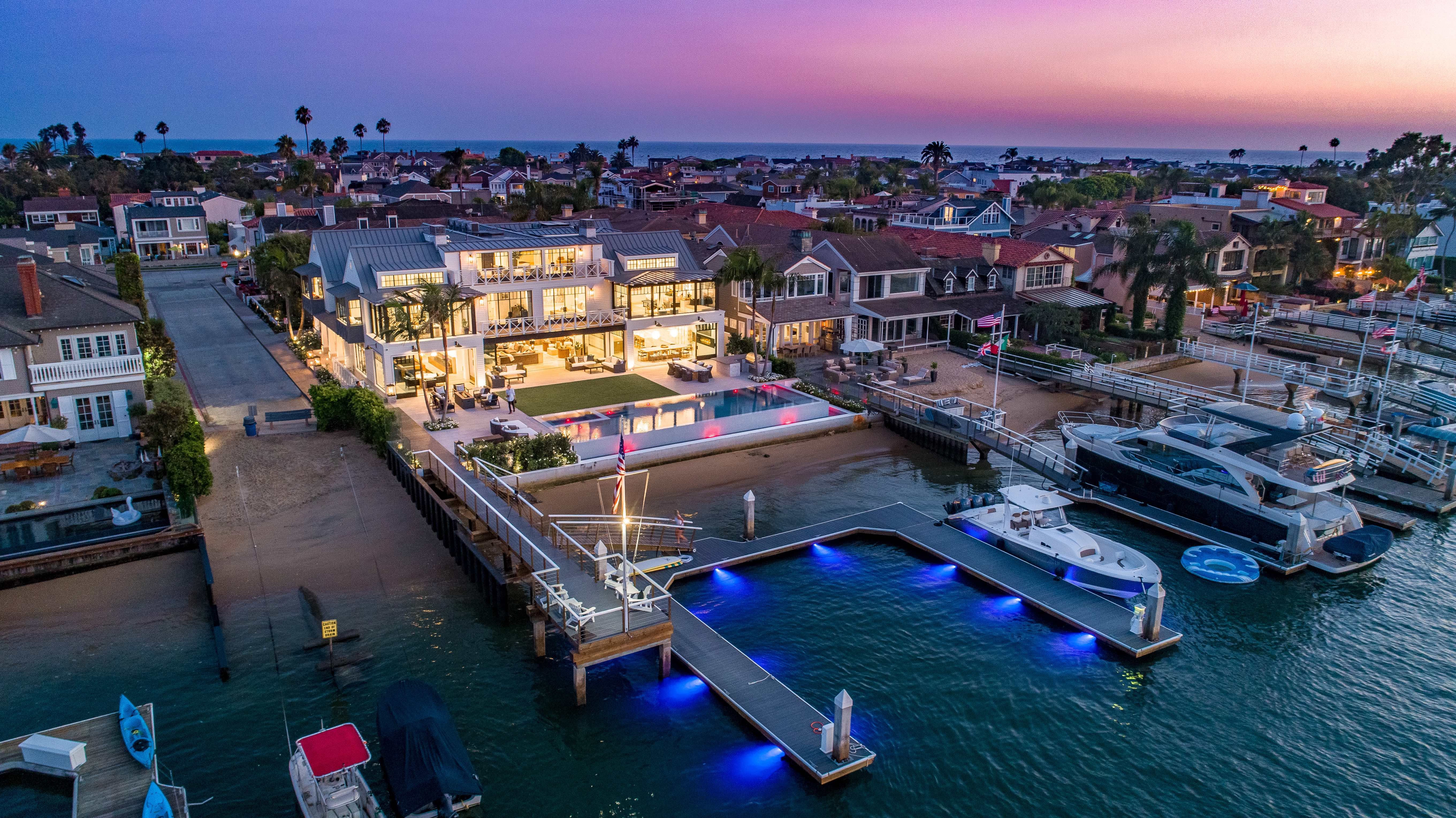
Smith, owner and principle designer of Orange County-based Details a Design Firm, frequently works with clients in Newport Beach. He says that lately he’s noticed increasing interest in transitional and modern looks, rather than typically popular traditional. The minimalist approach to decor that’s associated with these styles allows for more emphasis to be placed on the home’s stunning features, such as the spectacular views that are often found in local residences.
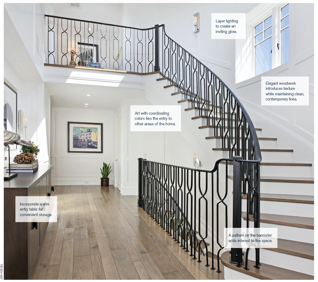
As a passageway that connects the interior and exterior, continuity in the entryway is essential to create natural flow between the two. Starting from the inside, one way to achieve this is by taking the colors that can be found in other areas of the home and incorporating them here. “There needs to be a tiein to the rest of the house with the art. That’s how I would incorporate some of the colors in the continuing space that you would see next,” Smith says. For example, if the living room is bathed in coastal blues, consider using a painting of a seascape or another piece of art in the entry that contains the same hues. A painted accent wall, textiles and furniture also provide opportunities to bring particular tones to the foyer.
In addition to color, texture plays an important role; Smith is fond of grasscloth wallpaper, which warms up the space along with layered illumination—think lamps on a console table in addition to ceiling lighting. “There are so many great decorative lighting fixtures … that’s a big element for me—that ‘wow’ fixture,” Smith says. Another way that he likes to add interest is via the floor; if using wood, try arranging the panels in a pattern instead of simply laying them straight; with tile or stone, organize them so that they resemble an area rug. He also suggests incorporating elegant details such as finish carpentry (molding, trim, et cetera) and paneling.
But the entrance doesn’t end inside. Outside, Smith suggests continuing to repeat the same colors to connect the space with the interior—this could be done with glazed pots or even plants.
The design should coordinate as well; for example, if the interior arrangement highlights a beautiful view, try a glass front door so that the scene can be appreciated as people approach the home, too. Finally, lighting here is just as important as it is inside. Smith is a fan of landscape lighting along pathways and shining on trees, which “softly illuminates the space,” rather than bright wall-hanging fixtures. A gentle glow invites guests in, and then guides them out.
By Katherine Duncan
As seen in Newport Beach magazine October/November 2016 issue.


